- Decision
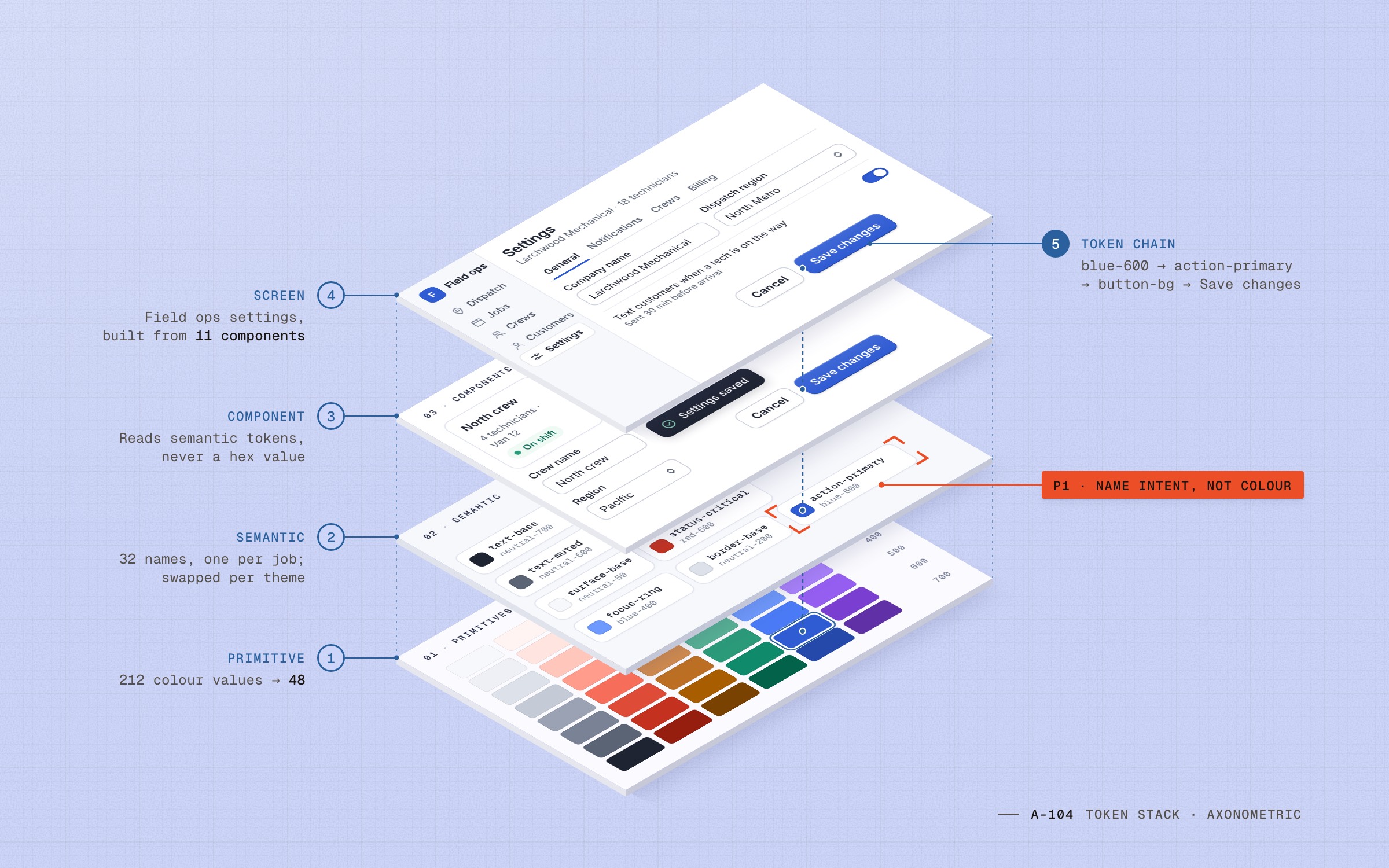
Three tiers: primitive → semantic → component
- Why
- Product code should never touch a raw value. Components read semantic tokens, semantic tokens read primitives, and only the system team edits primitives.
- Trade-off
- More names to learn up front, and a review for every new semantic token.
- Risk watched
- Semantic sprawl. We capped the layer at 32 tokens and audited it every quarter.
- Owner
- Me, with the front-end lead
One token system, three product teams
Three SaaS products, three brands, one codebase and no shared language. I led the token system that gave them one, and made adoption a choice teams made screen by screen.
Impact
Colour values in code
Colour values in code: from 212 to 48
Audit, Oct 2021 → v2, Sep 2022
Method: how “Colour values in code” was measuredComponent coverage
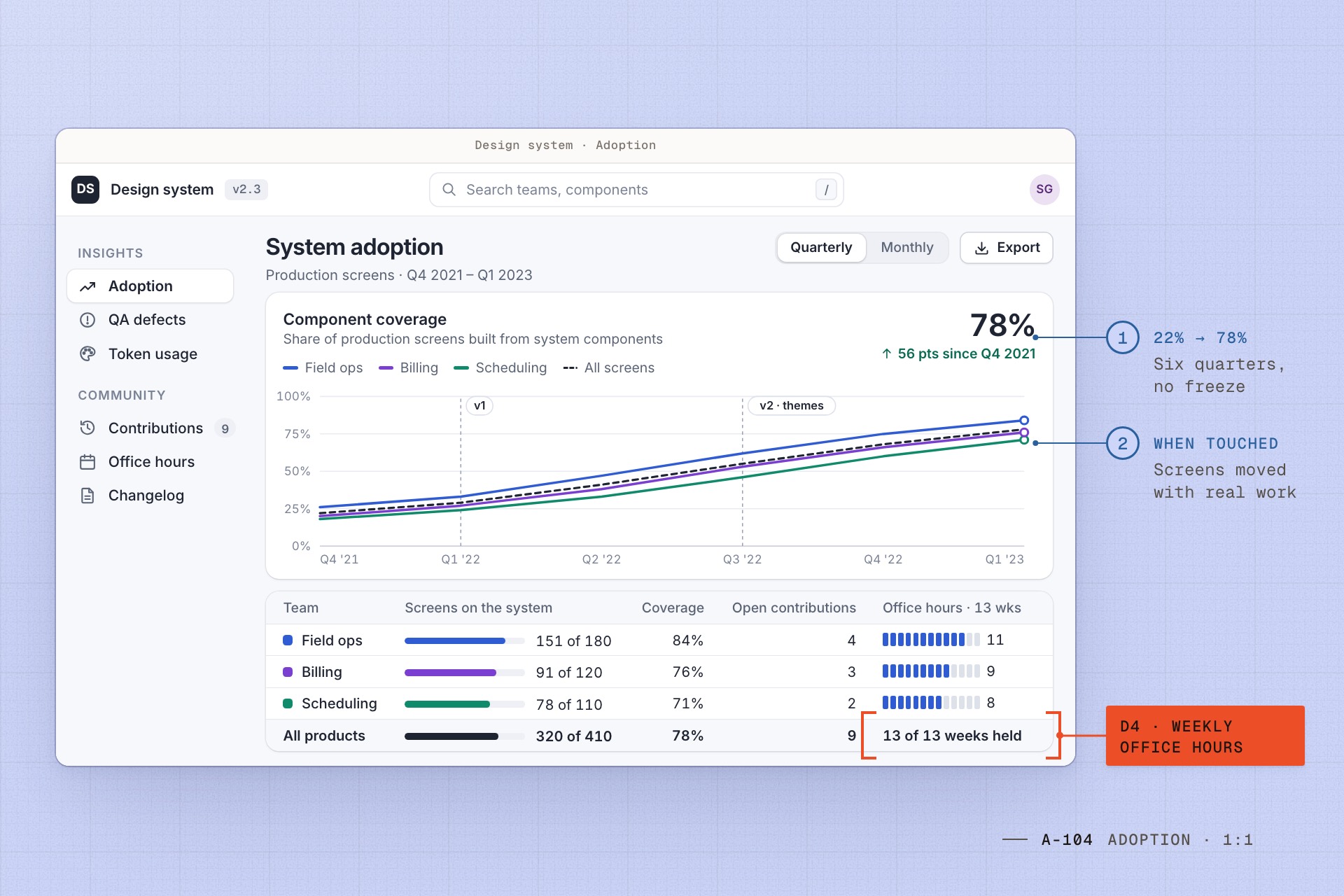
Component coverage: from 22% to 78%
Production screens, Q4 2021 → Q1 2023
Method: how “Component coverage” was measuredUI defects at QA
UI defects at QA: −31%, per release
Per release, two quarters after v2 vs the two before
Method: how “UI defects at QA” was measured
General notes6-minute sheet
The 60-second version
- Three teams were building the same UI three times over.
- I designed three token tiers, so code names what a colour is for and each brand is one file.
- We killed the big-bang migration: screens moved when teams touched them, backed by weekly office hours.
- Coverage rose 22% → 78%; UI defects at QA fell 31%.
Challenge
Existing conditions
“Which blue is the real blue?” was the question every new designer asked in their first week.
Three products shared one codebase but not one vocabulary: 212 colour values, 37 button styles and nobody who owned either. Designers redrew the same table in three files, and engineers copied whichever version was closest. Dark mode for Field ops meant hunting down hundreds of hex values, and every release found the same contrast bugs at QA.
Scope of work
My role
I led…
- Audited every colour, text style and button across the three products, and published the counts
- Designed the three-tier token model, its naming rules and the theme files
- Drew the core components with two designers, and reviewed every token change with front-end
- Ran weekly office hours and the contribution review for all three teams
- Reported coverage and QA defects to the three product leads every quarter
The team…
- Two designers built and documented the components, one leaning web and one mobile
- Three part-time front-end engineers owned the token build for web, iOS and Android
- Our QA engineer tagged UI defects by cause, so we could count them per release
- The platform PM negotiated time with each product team, sprint by sprint
- 1 × Senior UX designer (me)
- 2 × Product designers
- 4 × Front-end and QA engineers
- 1 × Platform PM
Constraints
What we had to work within
- Three products, three brands
- No feature freeze
- WCAG 2.1 AA
- Dark mode for one product
- Contributions from every team
- One source for web, iOS and Android
Principles
What we held to
P1
Name intent, not colour
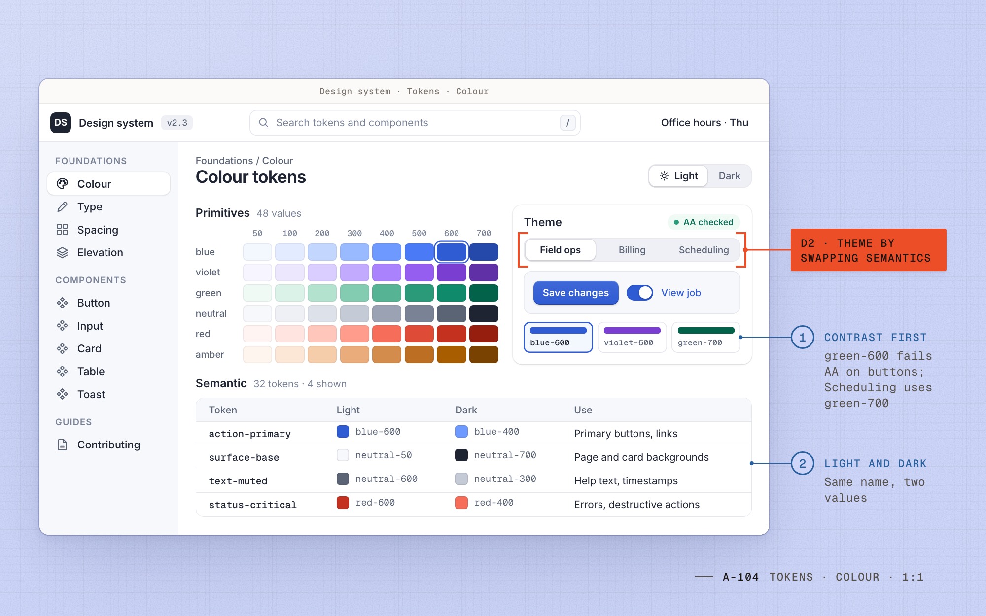
A token says what it is for, like action-primary or status-critical, so a rebrand or dark mode only changes values.
P2
Pave the common path; let edges stay custom
We systematized what every team built every week. Product-specific patterns stayed local until a second team needed them.
P3
Adoption is a product with its own users
Designers and engineers were our users. We measured coverage, held office hours and fixed their friction before adding components.
Decision log
Decisions
- Decision
Theme by swapping semantics, never by forking
- Why
- Three brands and one dark mode needed different values on the same components. A theme is one file of semantic mappings.
- Trade-off
- Product teams gave up one-off colours: each one became a token or went.
- Risk watched
- Contrast regressions inside a theme. Every mapping runs an automated WCAG 2.1 AA check, which is why Scheduling’s buttons use green-700.
- Owner
- Me and the two product designers
- Decision
Migrate every legacy screen up front
- Why
- It needed a feature freeze none of the three products could afford. Screens moved to the system when a team touched them for real work.
- Trade-off
- Old and new UI lived side by side in production for about a year.
- Risk watched
- Rarely touched screens staying legacy for good. We tracked them on the coverage dashboard and migrated the 20 most visited ourselves.
- Owner
- Me, agreed with the three product leads
- Decision
A contribution model with weekly office hours
- Why
- The system could not become a queue for three teams. Anyone could propose a component, and office hours turned a proposal into a review within a week.
- Trade-off
- An hour a week of senior design and front-end time, every week.
- Risk watched
- Contributions that fork instead of extend. A pattern merges only when a second team has a use for it.
- Owner
- The two product designers, on rotation
Audit
Count it before you fix it
Before drawing anything, I counted. A script pulled every colour, text style, radius and shadow out of the three codebases, and I sorted the results by hand: 212 colour values, 37 button styles, 23 text styles.
The counts did more than any deck. Product leads saw the cost in their own code, and the numbers became the baseline we reported against.
Fig. 01 Unique values in production code: the audit, October 2021, against v2, September 2022.
Tiers
Three names for every colour
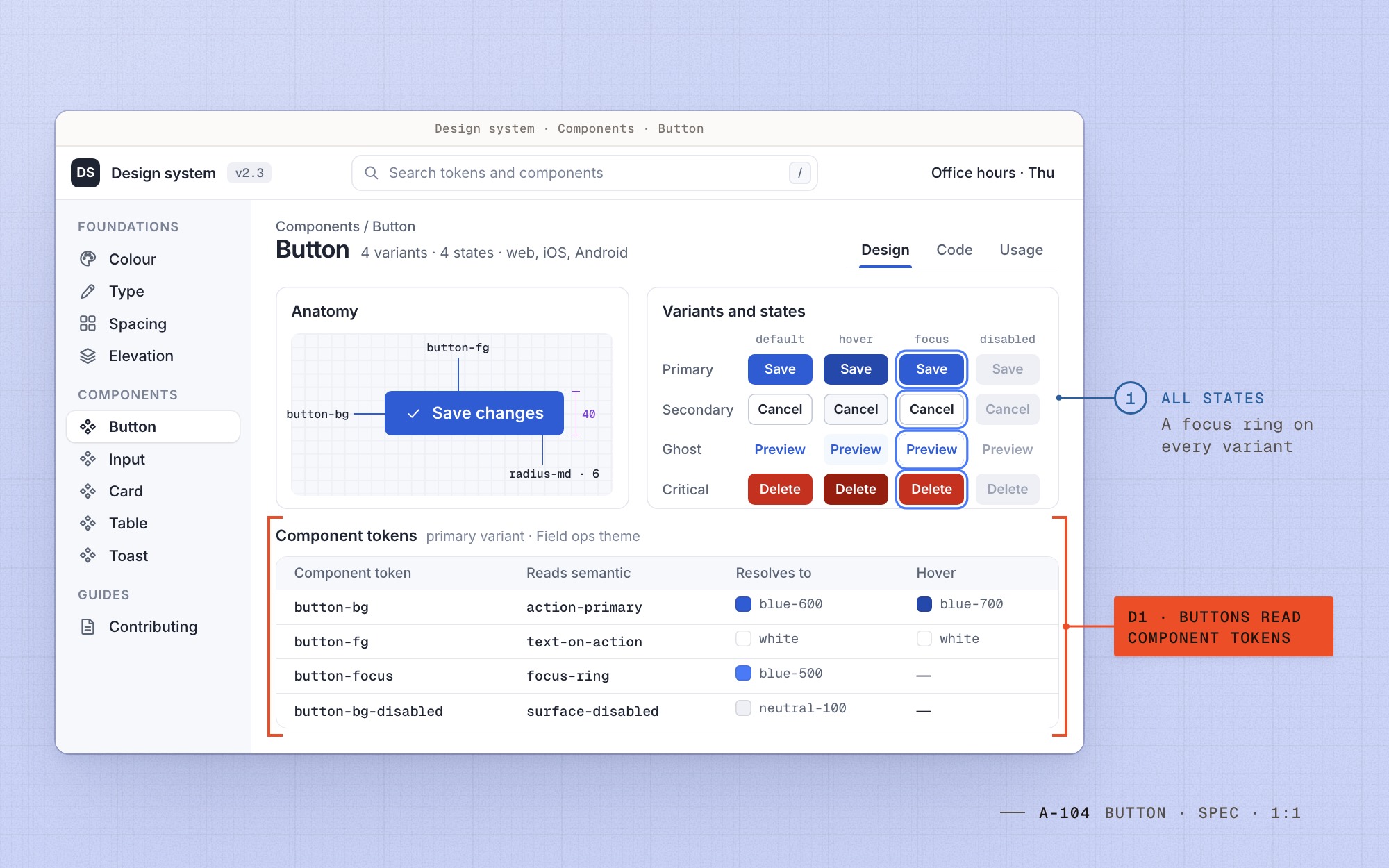
Primitives say what a value is: blue-600. Semantic tokens say what it is for: action-primary. Component tokens say where it goes: button-bg.
Product code may use only the last two. That single rule is what made theming and dark mode cheap later.
| Primitive | Semantic | Component |
|---|---|---|
blue-600 #2f5bd3 | action-primary | button-bg |
neutral-50 #f7f8fb | surface-base | card-bg |
neutral-600 #5b6475 | text-muted | input-help |
red-600 #c4321f | status-critical | alert-border |
Themes swap the middle column. Components read only the last one.
Fig. 02 D1Every colour has three names; product code never sees the first.
Themes
A brand is a file of mappings
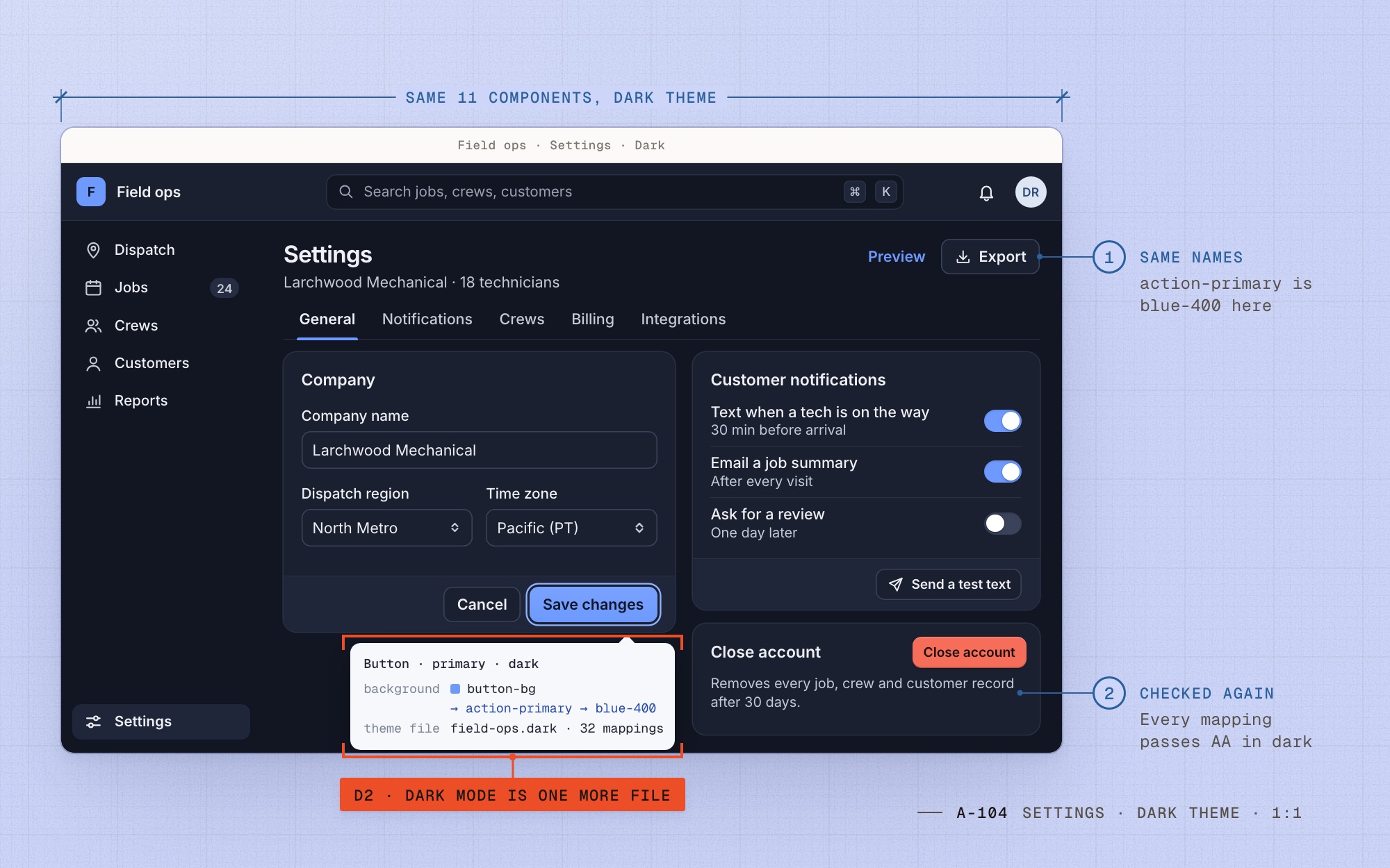
Field ops, Billing and Scheduling kept their own colours. Each became a theme: the same 32 semantic names pointed at different primitives, and dark mode for Field ops was one more file.
Every mapping ran a contrast check. Scheduling’s brand green measured 4.3:1 on white, so its buttons map one step darker, to green-700.
Adoption
No freeze, no big bang
We killed the plan to migrate every screen up front. Screens moved when a team touched them for real work, and coverage climbed every quarter without a freeze.
Weekly office hours kept the system from becoming a queue: 31 contributions merged, each one backed by a second team’s use case.
Before / after
Three tiers: primitive → semantic → component


Key screens
Key screens
01 / 03
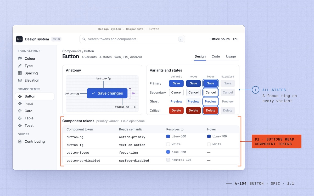
Fig. 06 D1Button docs: every state drawn, and every colour a component token reading a semantic one. 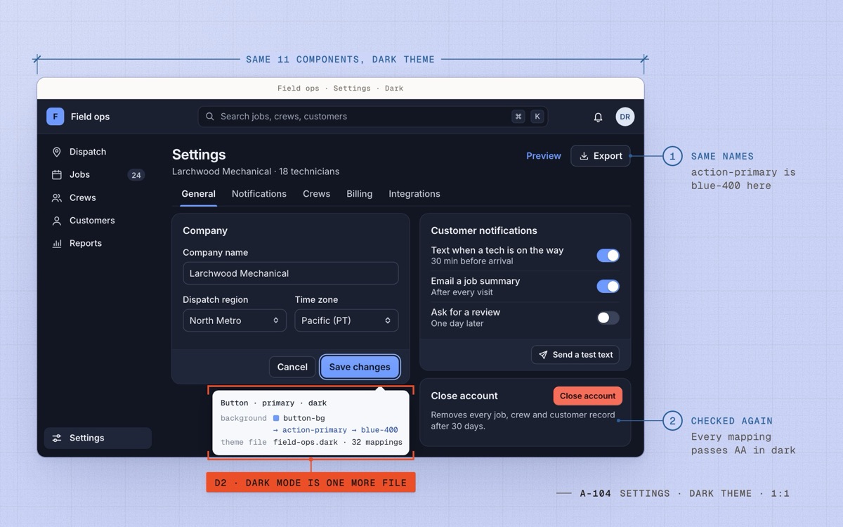
Fig. 07 D2Field ops in dark mode: the same 11 components and one more file of mappings. 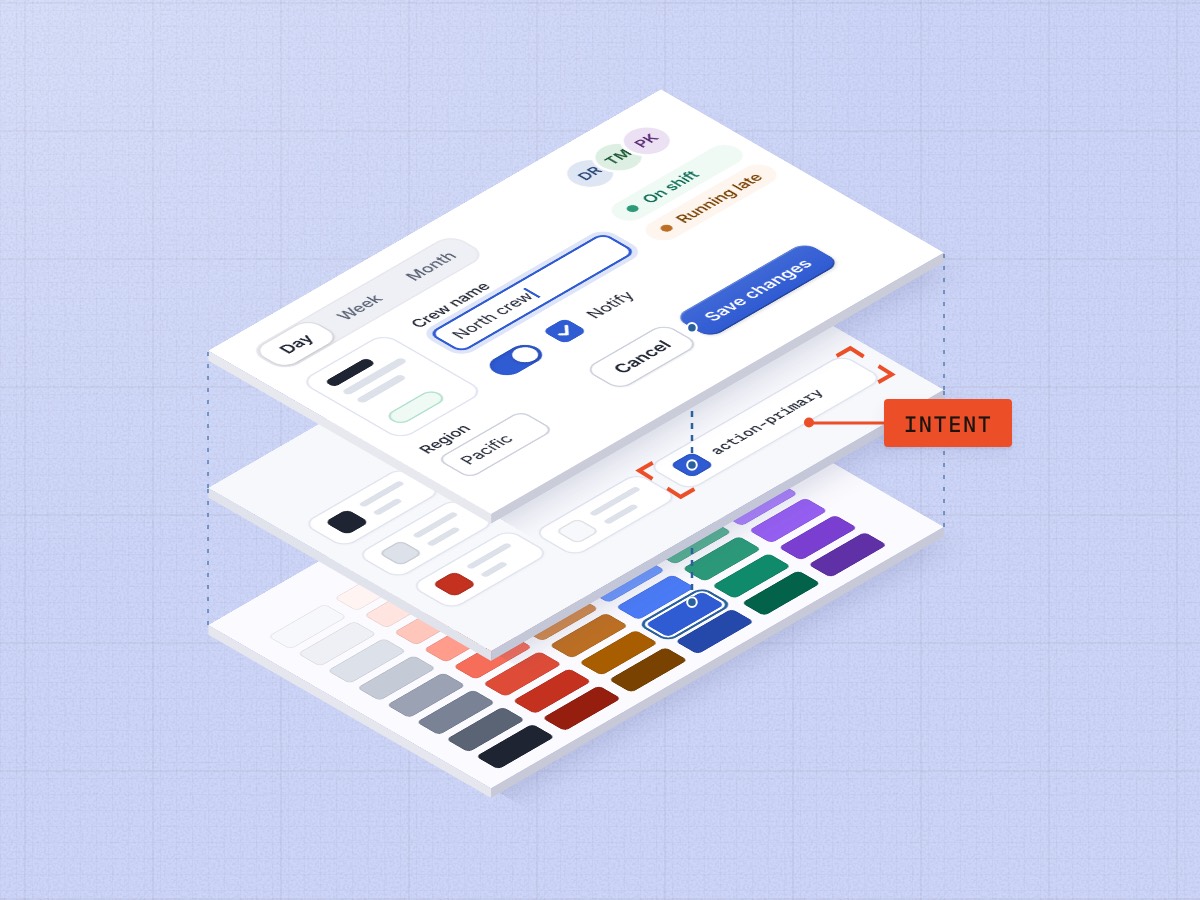
Fig. 08 Three layers, primitives to components, with action-primary marked.
Design system
The system at a glance
The primitives behind the three themes, the type ramp, and the first five components every team adopted.
- #2F5BD3
blue-600action-primary in Field ops - #7A3FD1
violet-600action-primary in Billing - #0F8A6A
green-600Scheduling brand; buttons step to green-700 - #F7F8FB
neutral-50surface-base in light mode - #C4321F
red-600status-critical
| Role | Spec | Rendered |
|---|---|---|
| Heading | Inter 600 20/28 | Crew settings |
| Body | Inter 400 14/20 | Text customers when a technician is on the way. |
| Label | Inter 500 13/16 | Dispatch region |
Components
- Button
- Input
- Card
- Table
- Toast
Outcomes
After launch
- Launch
2023
- +1 quarter
Coverage 41%
All three products building new screens on the system
- +2 quarters
Colour values 212 → 48
v2: three brands and Field ops dark mode, all by swapping semantics
- +4 quarters
Coverage 78% · UI defects at QA −31%
Most production screens migrated, none of them by a freeze
Learnings
Revisions
Paths not taken
- One brand for all three products. Each product was sold on its own and its colours carried real recognition, so we themed instead.
- Tokens generated straight from the design files. The tooling was not reliable in 2021, so tokens lived in code and were reviewed like code.
- A dedicated system team of six. We stayed at two designers and part-time engineers, and grew contributions instead of headcount.
Two reflections
- I would put one front-end engineer on the system full-time from day one. Part-time ownership slowed the token pipeline by about a quarter.
- Coverage was the right number for leadership, but office-hours attendance warned me earlier when a team was about to fork.
Go deeper
Details
Detail 1How the tokens are named
Primitives are hue-step: blue-600, neutral-50. Six ramps of eight steps, 48 values in all.
Semantic tokens are role-variant: action-primary, surface-base, text-muted, status-critical. There are 32, and adding one needs a review.
Component tokens are component-part: button-bg, card-bg, alert-border. Only components read them.
Detail 2The contribution model
Anyone could bring a pattern to Thursday office hours. If a second team needed it, the proposer and a system designer built it together; if not, it stayed in the product.
Every merge shipped with documentation, a design-file component and code for web, iOS and Android in the same release.
Detail 3How we measured it
Colour values: unique hex and rgba values in the three codebases, at the audit and again at v2.
Coverage: production screens built only from system components, counted by a script each quarter and checked by hand for the 50 most visited screens.
UI defects: bugs our QA engineer tagged as visual or spacing issues, per release, for the two quarters after v2 against the two before.
Continue the set

